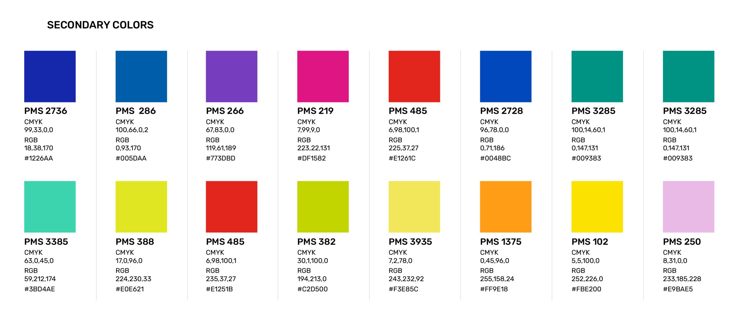
BCC COLORS
The BCC brand uses primary and secondary color palettes. The primary color palette, “DUO TONES” should always be used as a starting
point for design. It can range from formal to casual and from subtle to bold, depending on the purpose and audience of each communication piece. The secondary color palette should be used for a more subdued graphic approach for example internal communications, data, etc.